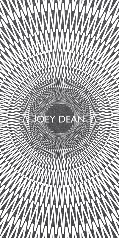
The concept behind Kaleidoscope Magazine was to present each issue's articles as conflicting or opposing viewpoints on contemporary topics of discussion. This was reflected in the design and layout of the magazine, which pits one clean cut sans-serif page layout which makes good use of white space against a raw, hand rendered, cut & paste style page layout. All while retaining an identical visual aesthetic in terms of column width and bleed space, that reinforces their connection to the same magazine.
Kaleidoscope Magazine
A men's fashion magazine designed for emerging fashion journalist and stylist Daniel Higgins. Daniel has styled photo-shoots for magazines such as Recognise, and worked for the UK's biggest selling mens magazine Mens Health
The concept behind Kaleidoscope Magazine was to present each issue's articles as conflicting or opposing viewpoints on contemporary topics of discussion. This was reflected in the design and layout of the magazine, which pits one clean cut sans-serif page layout which makes good use of white space against a raw, hand rendered, cut & paste style page layout. All while retaining an identical visual aesthetic in terms of column width and bleed space, that reinforces their connection to the same magazine.
The concept behind Kaleidoscope Magazine was to present each issue's articles as conflicting or opposing viewpoints on contemporary topics of discussion. This was reflected in the design and layout of the magazine, which pits one clean cut sans-serif page layout which makes good use of white space against a raw, hand rendered, cut & paste style page layout. All while retaining an identical visual aesthetic in terms of column width and bleed space, that reinforces their connection to the same magazine.
