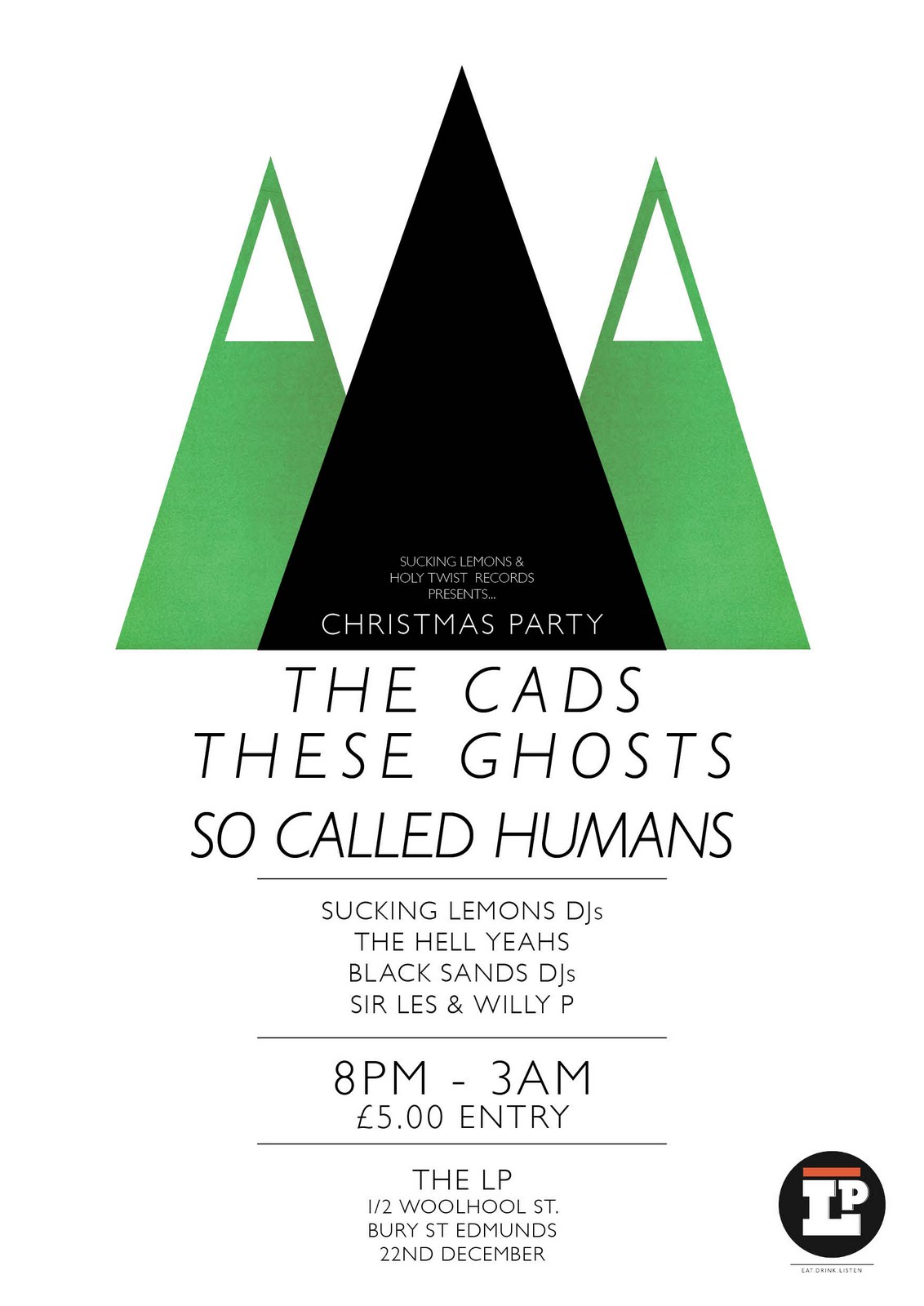
Christmas Party - Sucking Lemons & Holy Twist Records
Flyer designs for Sucking Lemons and Holy Twist Records Christmas party, featuring The Cads, These Ghosts and So Called Humans


Greetings To The New Brunette
A limited set of letterpress prints created during my time at Hand & Eye. The prints are created from traditional font types and typographically render lyrics from the Billy Bragg song 'Greetings To The New Brunette'.
Original Print

Enlarged Version

Letterpress Components

M83 - America
Concept music video for M83's 'America'. Taken from the album 'Dead Cities, Red Seas & Lost Ghosts'. Footage borrowed from the BFI Creative Archive Licence Group and the Prelinger Archives.
Halftone T-Shirt Design
A completely self designed and printed t-shirt, for no purpose other than pure enjoyment.


Los Explovisos


Flying Over
Poster for French Rock & Roll band Flying Over's short stint of upcoming London shows. Tour compiled and promoted by Holy Twist Records.


Franko Fraize - The 140 Show
Artwork for Franko Fraize's new E.P. The 140 Show.
The title of the E.P. references Franko Fraize and DJ I.C's underground radio show and as such, the imagery for the front cover also reflects this.
The 140 Show is largely available by download, as well as through a limited edition of 100 printed and pressed CD copies, from www.frankofraize.bandcamp.com.
Front

Back


Back

Holy Twist Records Poster Design

As always, there were a bunch of unused designs on the project, which I've lovingly displayed below.


June On The West Coast
What started out as an initial experimentation shooting digital video for the first time, resulted in a small music video for Bright Eyes' June On The West Coast.
The Cads
Emerging band The Cads were invited to tour Germany with Darwin Deez and so this poster was created in homage to the tour. You can see The Cad's tour video, which features my artwork in the opening shot.

London 1970
An illustrated conversation about a generation of Londoners that vacated the capital city during the 1970s due to overcrowded living conditions.
Kaleidoscope Magazine
A men's fashion magazine designed for emerging fashion journalist and stylist Daniel Higgins. Daniel has styled photo-shoots for magazines such as Recognise, and worked for the UK's biggest selling mens magazine Mens Health
The concept behind Kaleidoscope Magazine was to present each issue's articles as conflicting or opposing viewpoints on contemporary topics of discussion. This was reflected in the design and layout of the magazine, which pits one clean cut sans-serif page layout which makes good use of white space against a raw, hand rendered, cut & paste style page layout. All while retaining an identical visual aesthetic in terms of column width and bleed space, that reinforces their connection to the same magazine.
The concept behind Kaleidoscope Magazine was to present each issue's articles as conflicting or opposing viewpoints on contemporary topics of discussion. This was reflected in the design and layout of the magazine, which pits one clean cut sans-serif page layout which makes good use of white space against a raw, hand rendered, cut & paste style page layout. All while retaining an identical visual aesthetic in terms of column width and bleed space, that reinforces their connection to the same magazine.
Twenty-Seven Days In Thailand
This short film exploring a twenty-seven day expedition through Phuket, South Thailand, has been pieced together from over three hundred photographs documenting the journey. Photographs taken by Elliott White, Joey Dean and Simon Nunn during the Summer of 2009.
Reflections On Modern Living
Inspired the texts of 1960s revolutionary thinkers The Situationist International, 'Reflections On Modern Living' is a pamphlet designed to advocate an emphasis on enjoying living life rather than striving to reach any kind of capitalist 'goal'. A limited amount were screen printed on newsprint and then distributed to the public at specific London Underground stations.
DOWNLOAD a digital PDF of Reflections On Modern Living and email it to your friends and colleagues.


DOWNLOAD a digital PDF of Reflections On Modern Living and email it to your friends and colleagues.


The 140 Show
As Franko Fraize continues to write and release music, I continue too, working with him to direct his visual identity.
We collaboratively came up with the idea for the music video for his latest release The 140 Show, which I then filmed, directed and edited in just two weeks.
The video adopts a 'Fly on the wall' technique, following Franko as he embarks on what is a regular journey to his and DJ I.C's pirate radio show which the song has been named after.
The video won a position at the BBC Norfolk Introducing Music Video Festival, in which it was displayed in The Forum, Norwich's popular library and community venue throughout June and July.
Blighters, Heartbeat
A 7" single sleeve designed for New Wave band Blighters. The single is called Heartbeat and utilises photographs of Love Heart sweets, a well known past time favourite, to reflect the nature of the song. This images springs to life when viewed through the 3D glasses that come free inside the 7" single sleeve. You can buy the 7" single at HMV or in MP3 format at Play.com


Part of this brief was also to create the whole general identity for use on the Blighters Myspace Page. Below you can see two screenshots of the Myspace web layout, which adopts the same identity present on the Heartbeat single sleeve.


The 7" Single on sale at HMV


Label
Part of this brief was also to create the whole general identity for use on the Blighters Myspace Page. Below you can see two screenshots of the Myspace web layout, which adopts the same identity present on the Heartbeat single sleeve.


The 7" Single on sale at HMV


Double Flintlock
As with their E.P. sleeve, the band wanted to represent their Old English inspiration.
The t-shirt shows a mixed media approach, combining the images of traditional Flintlock pistols (reduced to black illustrations), and a loose illustrated typography of the band's logo.


T-Shirts being sported at a live performance.
William English, Home
An E.P. designed for Norfolk Hardcore Punk band William English. The band take much of their inspiration from Old English aesthetics and folk tales.
The photographs for the cover were taken by Julie Dean, on a battle re-enactment taken place on a celebratory day for English revolutionary Thomas Paine. They were then digitally manipulated in order to age them, and photographed against a damaged, white wall to give the suggestion of a museum or gallery type setting.


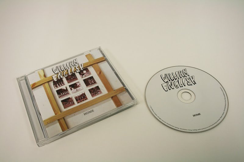


Buy the E.P. here

Artwork as published in Rock Sound Magazine.
The Meeting Place
The meeting place is a short film I created as a third year degree project. It explores the stylistic features of foreign film. It does this by manipulating expected stereotypes of 1960s French New Wave cinema, such as British actors who look European and shot against the background of London's streets in a typical black and white grain. By combining the features of foreign film with strong beacons of British identity all the important cinematic techniques used to achieve the 'foreign film' are made more apparent.
The loose storyline follows a young man traveling to meet his heartbreaking ex-girlfriend who is returning from a new year in Paris with her new husband.

The loose storyline follows a young man traveling to meet his heartbreaking ex-girlfriend who is returning from a new year in Paris with her new husband.

Thee Vicars Tour Posters
This is a collection of tour posters made for Thee Vicar's 2009 Psychotic Beat tour.


Only the top two were used by the band to promote the tour.


Subscribe to:
Posts (Atom)